Context
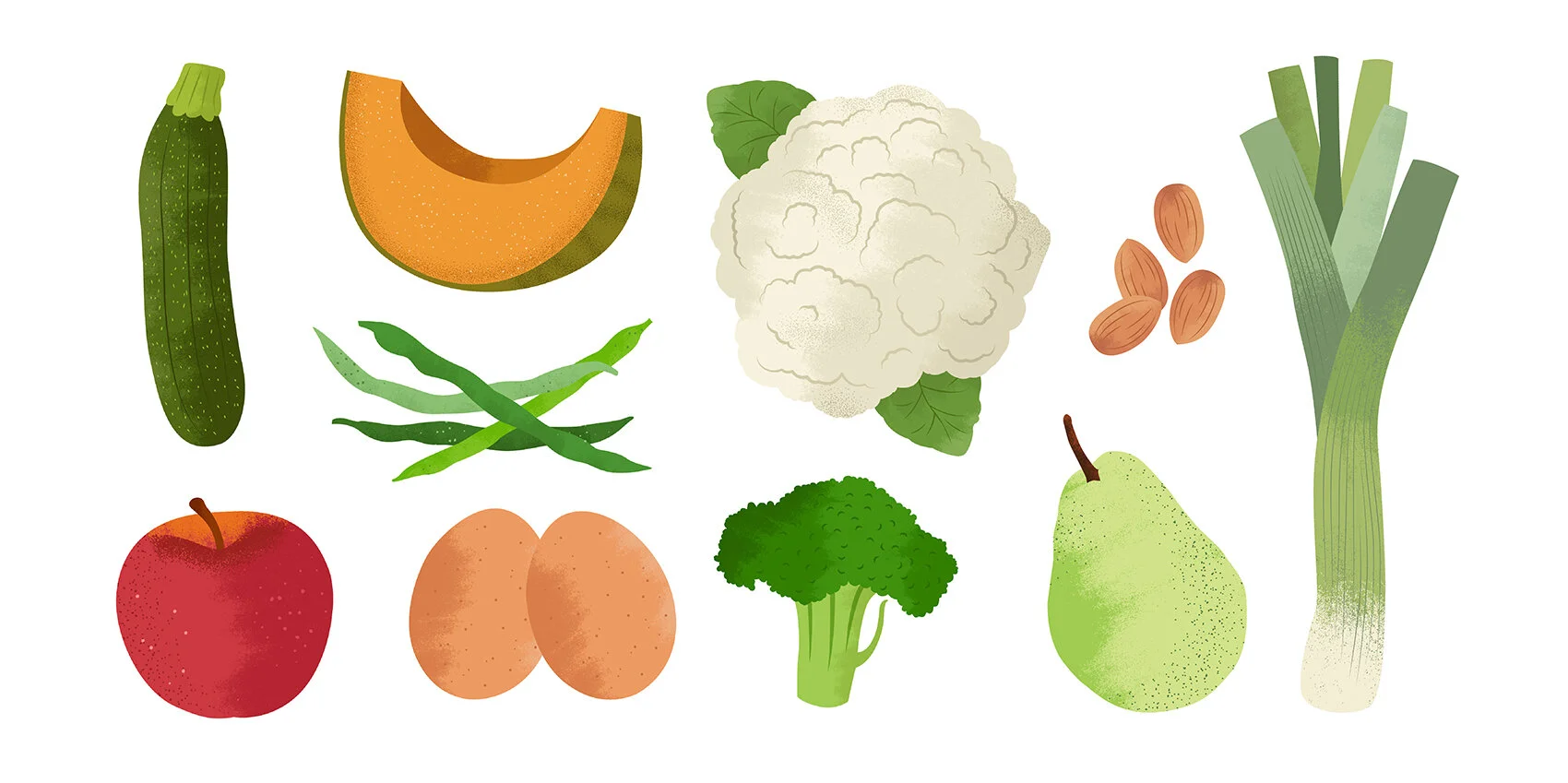
Founded in 2015, Imperfect Foods began as a produce delivery service focused on rescuing “ugly” or overlooked food that would otherwise go to waste. As the company expanded into a full-scale online grocer, the brand needed to evolve alongside it, moving beyond its early startup identity while still preserving the personality, accessibility, and mission that made the company distinctive.
Solution
Our team developed a refreshed brand identity and scalable design system that reflected Imperfect’s broader mission of making sustainable shopping easy, accessible, and enjoyable. The rebrand balanced warmth and activism while creating enough flexibility to support a rapidly growing product and grocery ecosystem across packaging, digital, editorial, and marketing touchpoints.
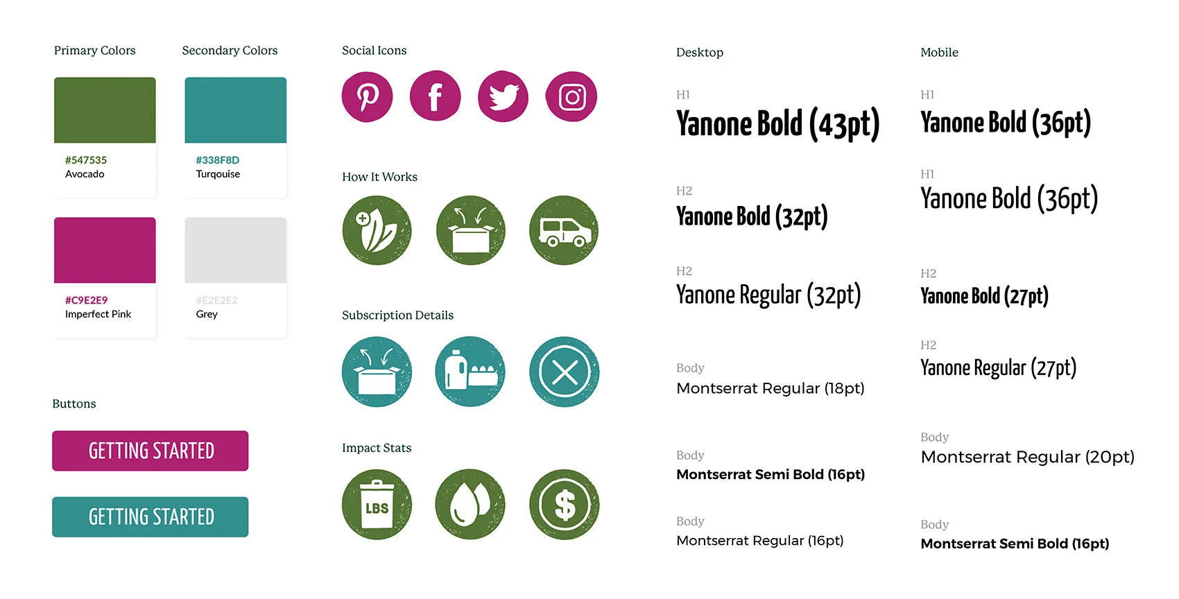
The system extended across typography, illustration, photography direction, iconography, packaging, and UI, helping create a cohesive and recognizable experience across the brand.
My Role
As Lead Designer, I played a key role in the visual development of the rebrand system across identity, illustration, packaging, iconography, and digital applications. I collaborated closely with the Design Director, product, and engineering teams to help translate the brand strategy into a flexible visual system that could scale with the company’s growth.
Design Director: David Z. Voll
Lead Designer: Angie Garland
Photography: Colette Krey
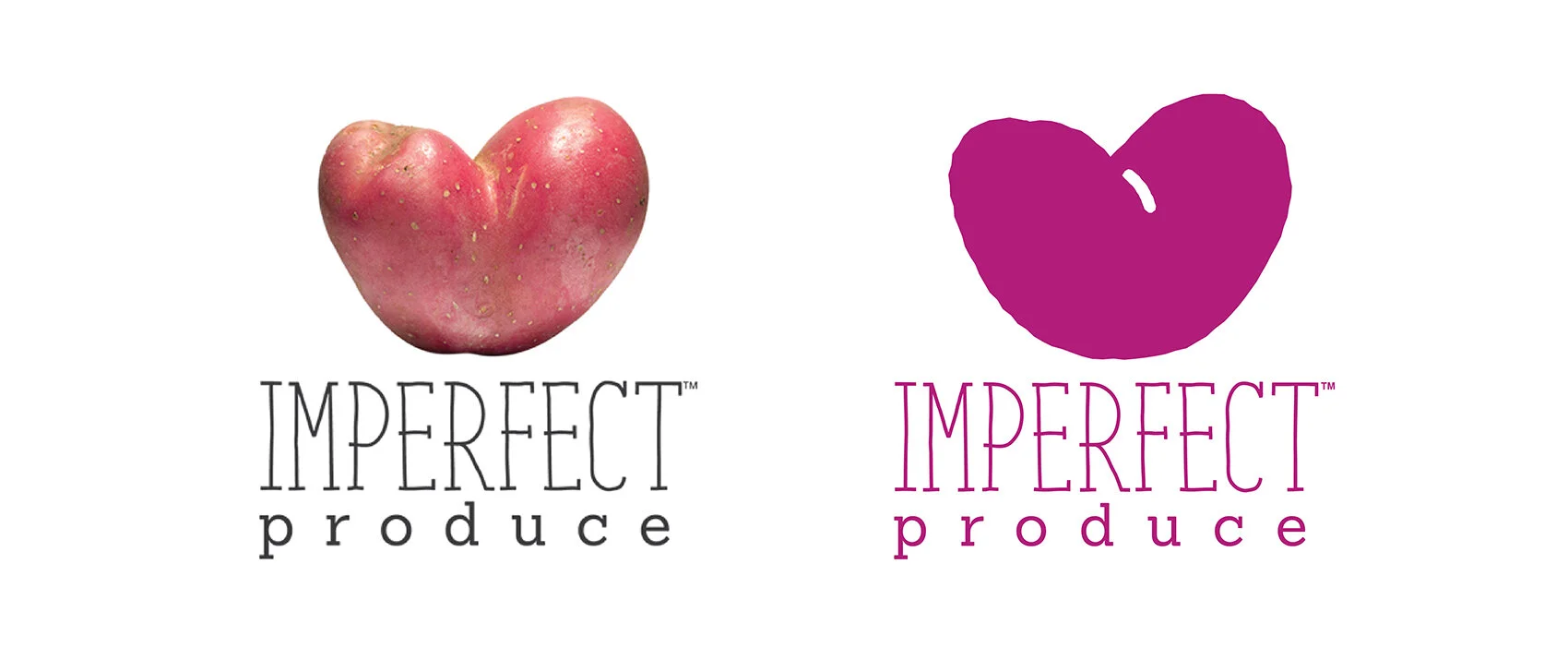
Before diving into the redesign, we took time to reflect on what to preserve and what to evolve from the existing logo. While it had its shortcomings, the logo carried a sense of nostalgia and brand equity that we didn’t want to lose. There was a clear consensus to keep produce as a central element of the mark, while giving ourselves the freedom to completely reimagine the typography.
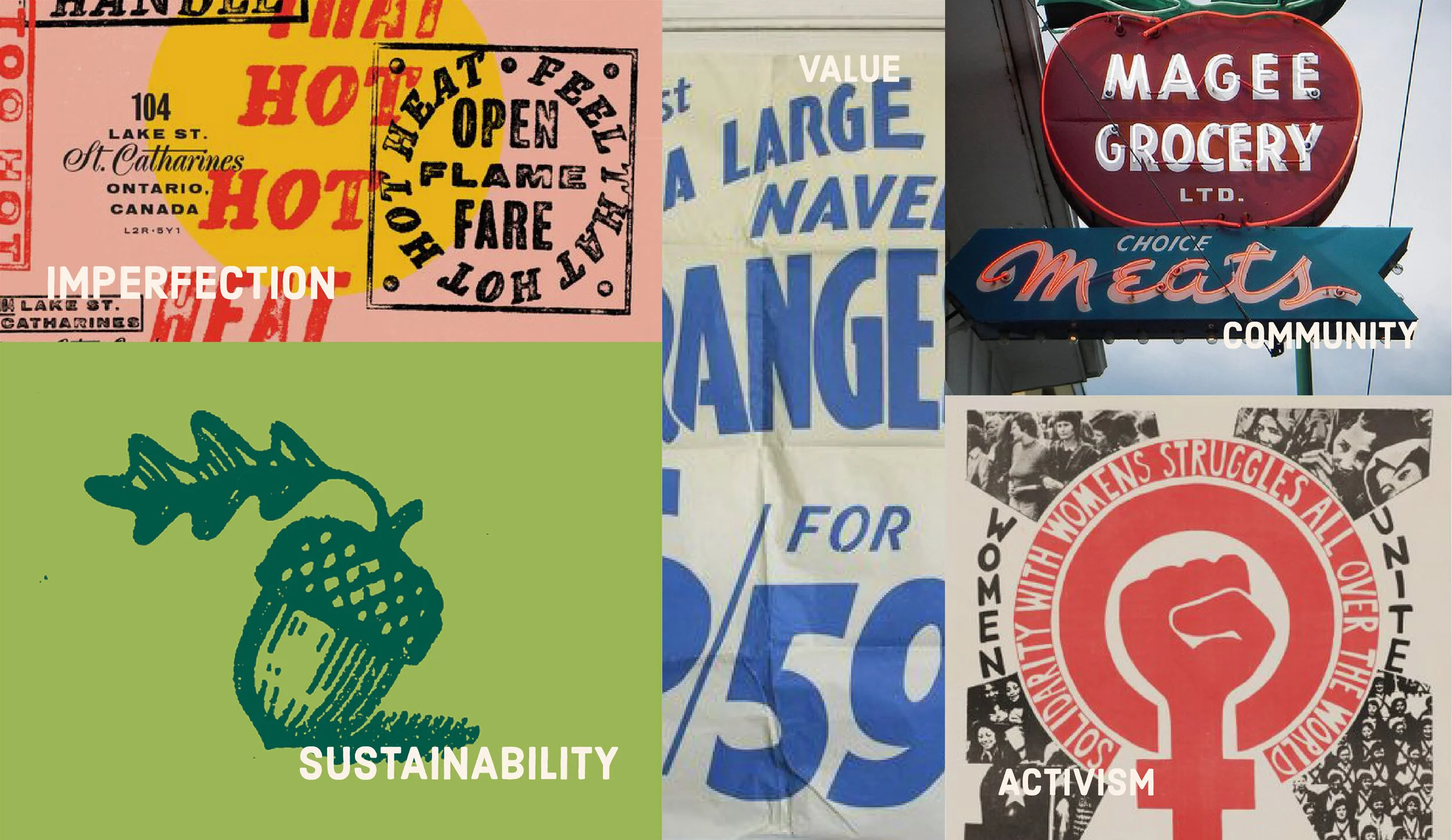
With our positioning, vision, and market research in place, we shifted focus to how the new brand would take shape visually. We explored design cues that captured the spirit of community, activism, and sustainability—ensuring the visual identity reflected the heart of the brand.
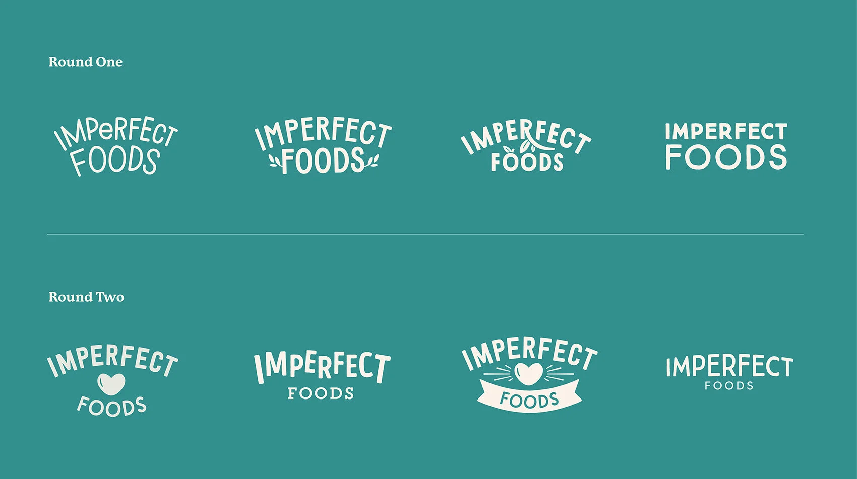
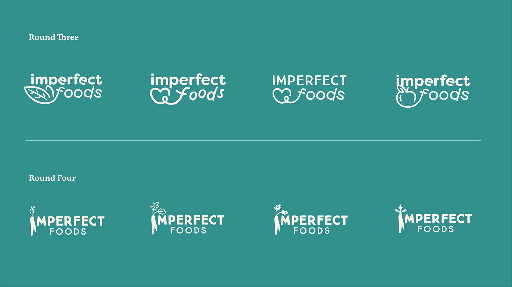
With our brand strategy finalized and visual references gathered, we moved into design. It was clear the wordmark needed to feel charming and imperfect, so we created custom, hand-drawn letterforms—embracing rounded shapes and subtle quirks to reflect the brand’s personality.
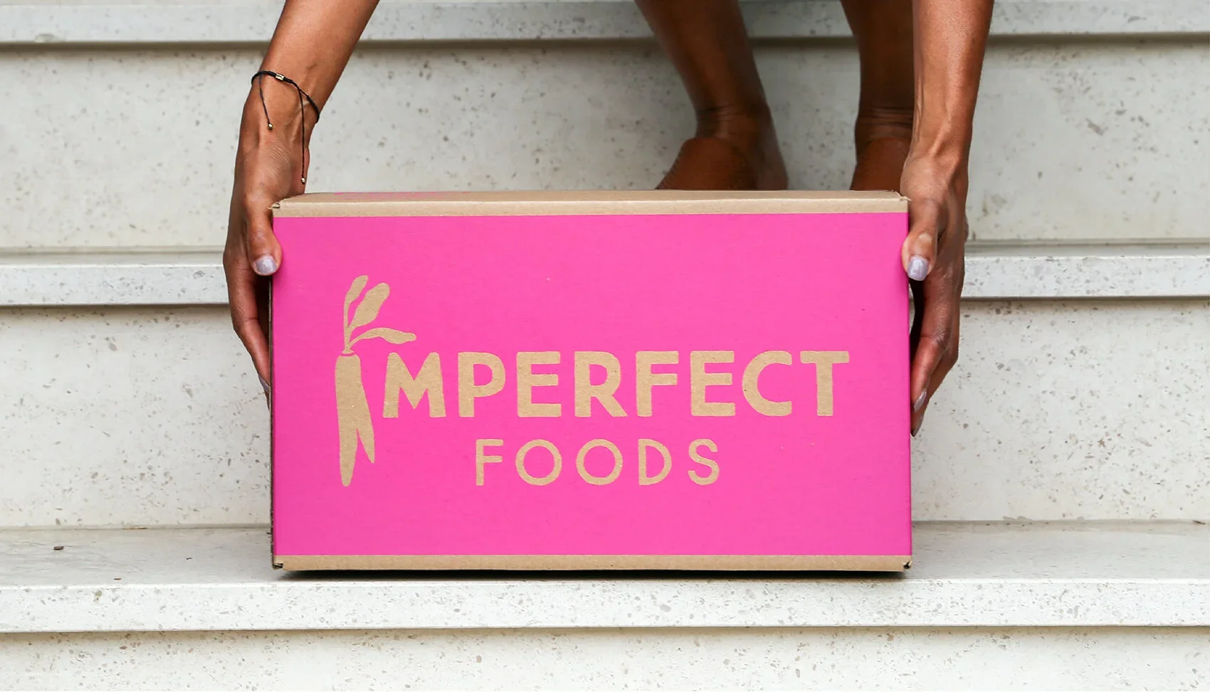
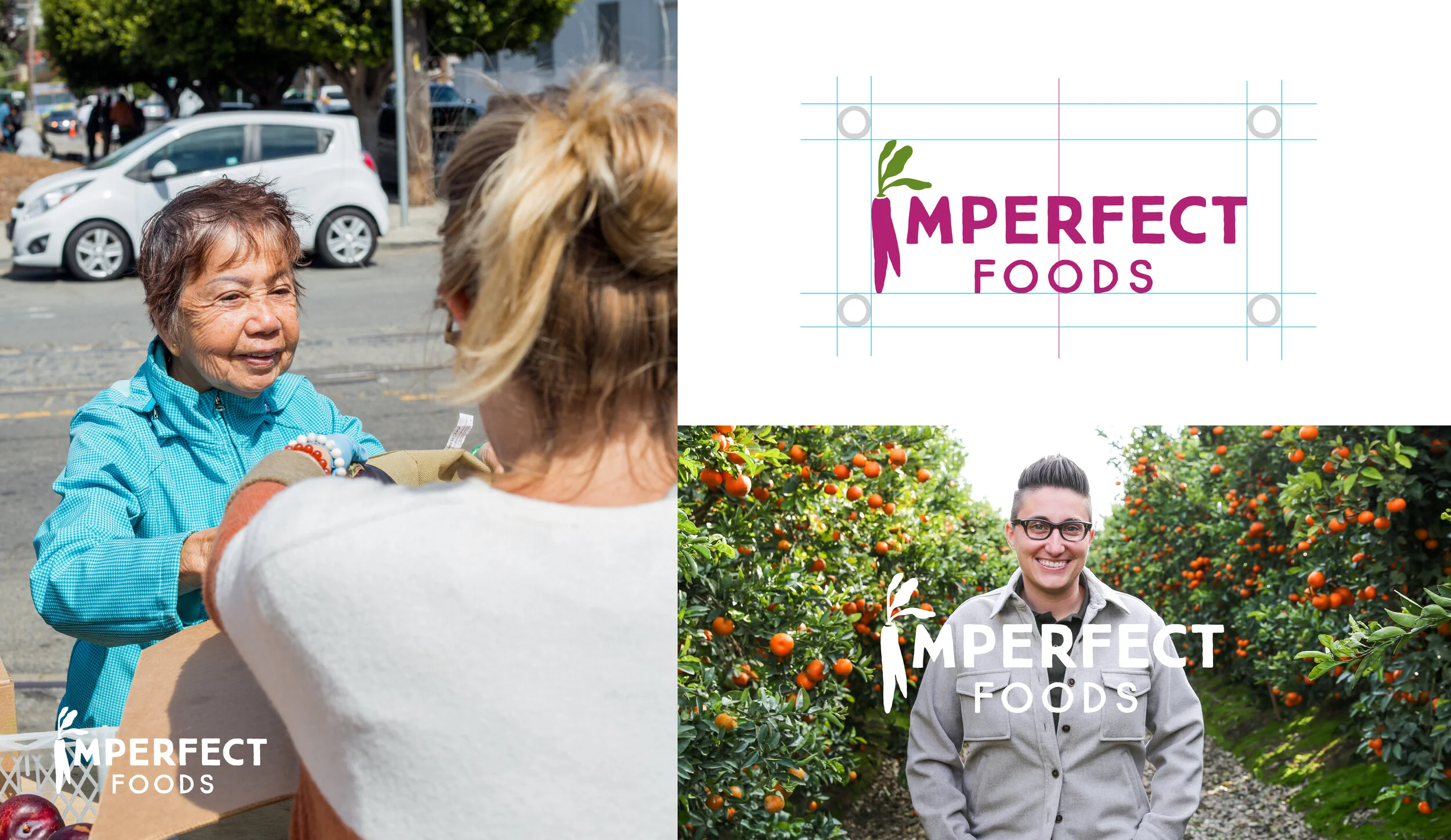
The final logo features a hand-drawn, bold sans-serif typeface designed for clarity at any scale. At its heart is the "wonky carrot"—a playful nod to the brand’s roots in rescuing imperfect produce and a subtle reflection of the company’s core value: "using the whole carrot."
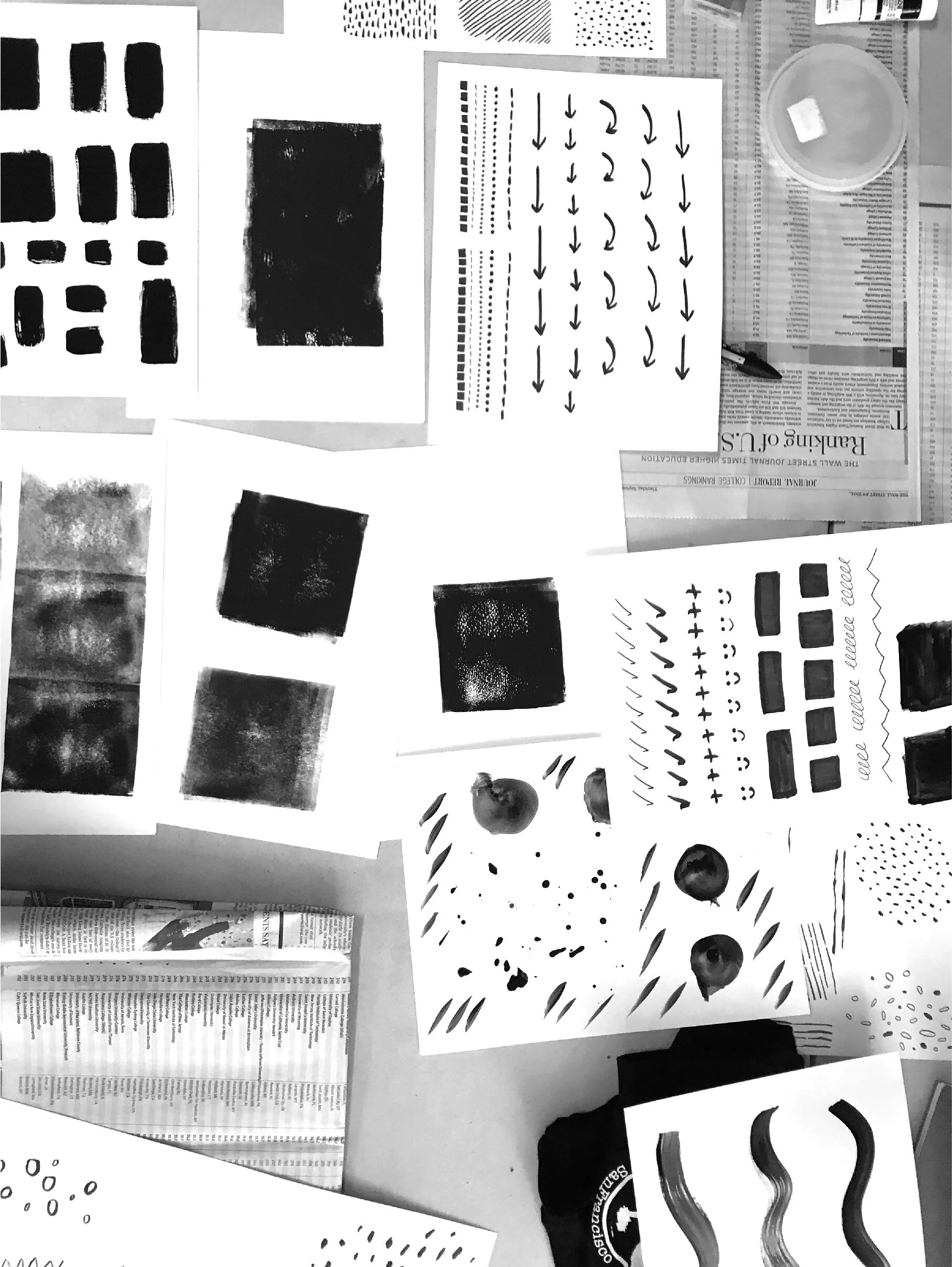
Hand-drawn textures played a key role in setting us apart from competitors. We wanted our visuals to feel unmistakably ours—imperfect, human, and crafted by hand. Just as the brand delivers "groceries on a mission," the design needed to carry that same sense of activism and authenticity.
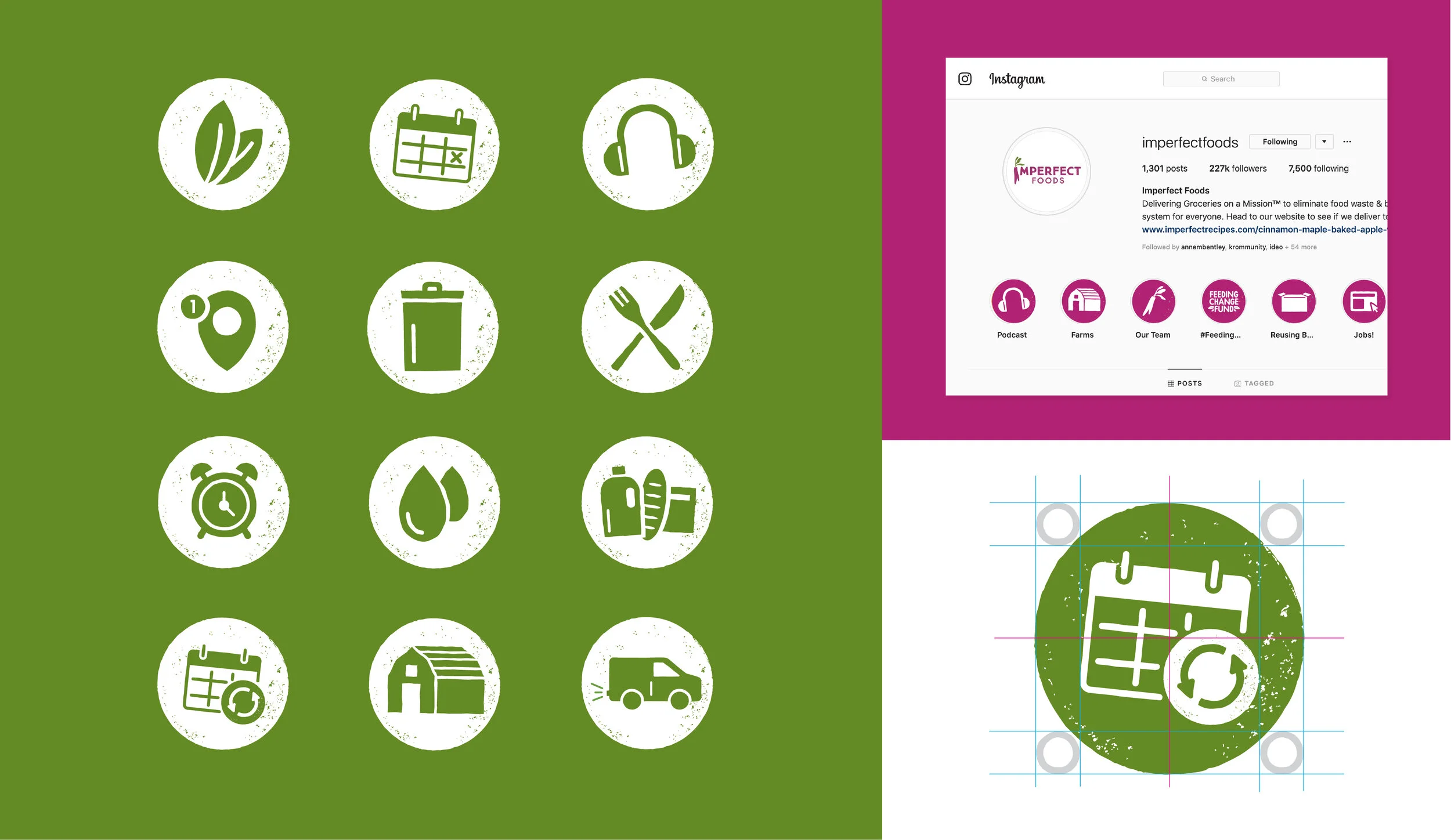
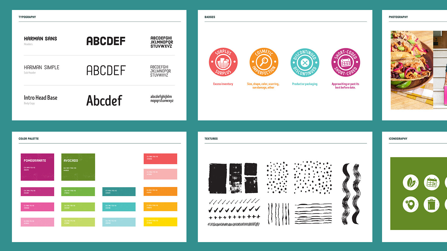
To help explain the complexities of Imperfect’s food delivery service across various channels, we created a library of branded icons—making visual storytelling clear, cohesive, and engaging.
Building on our hand-painted textures, we developed a bold, screen-printed illustration style. Inspired by our "Groceries on a Mission" tagline, the look draws from vintage protest posters—imperfect, expressive, and full of purpose.
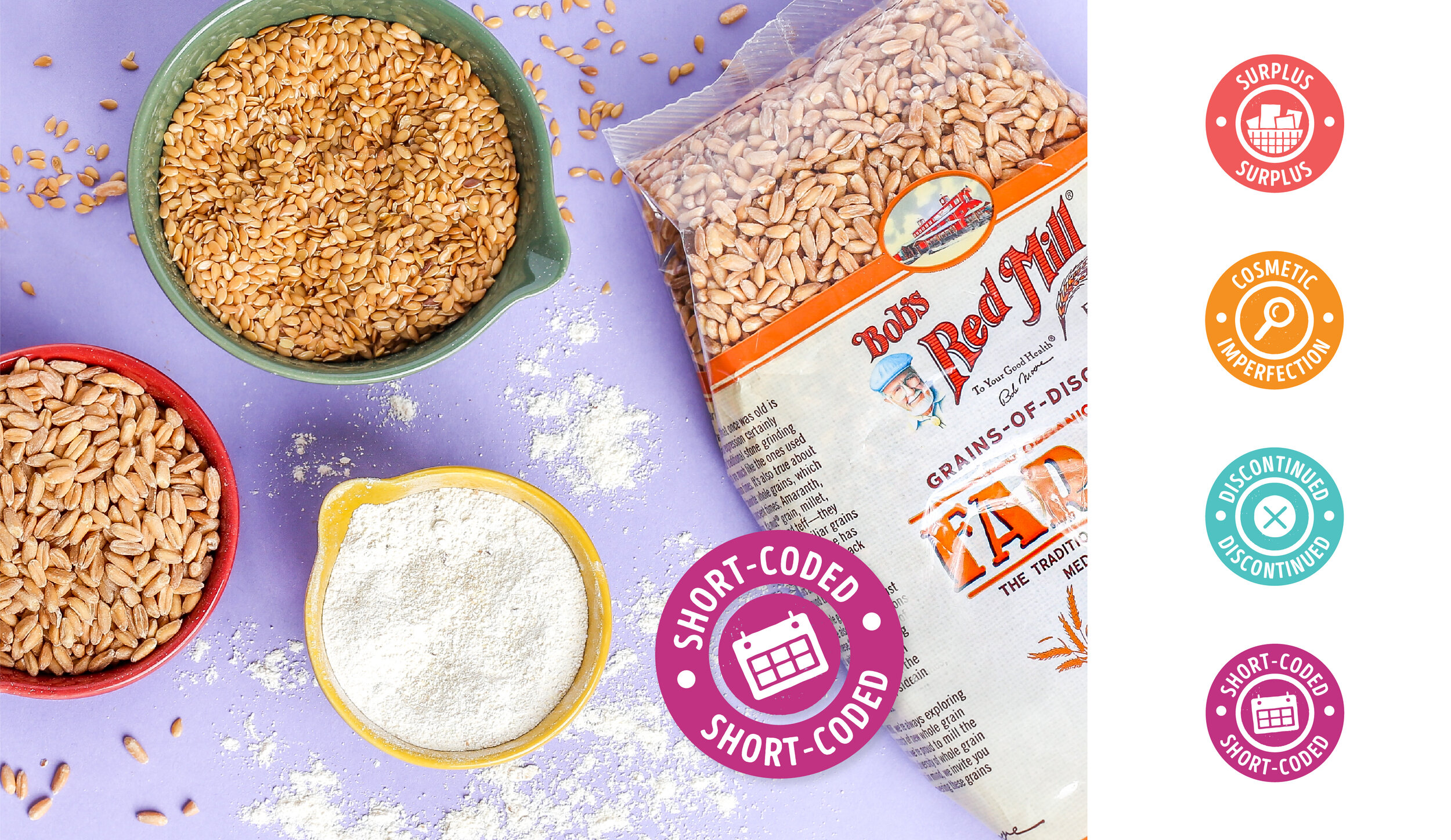
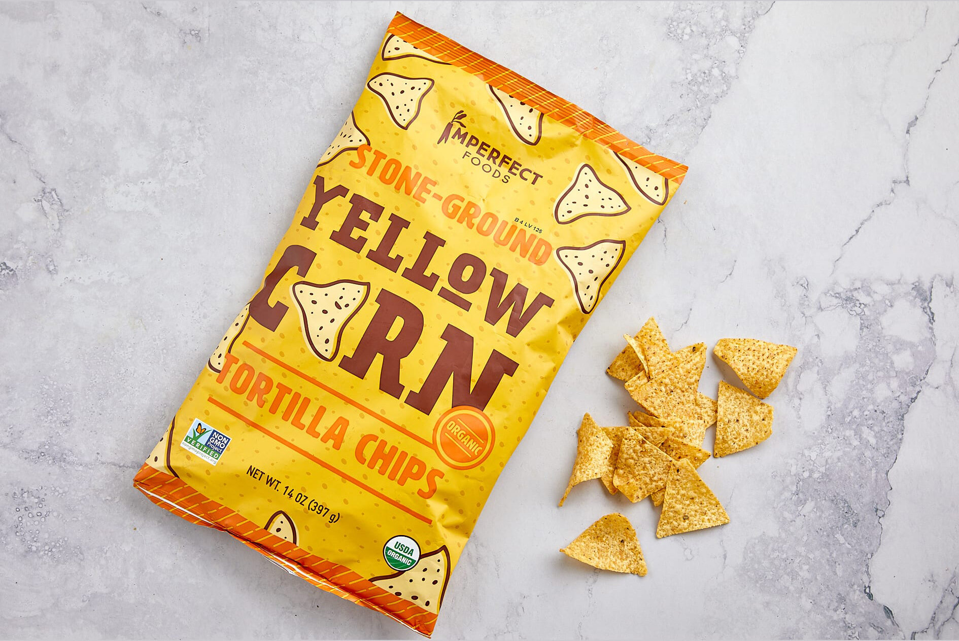
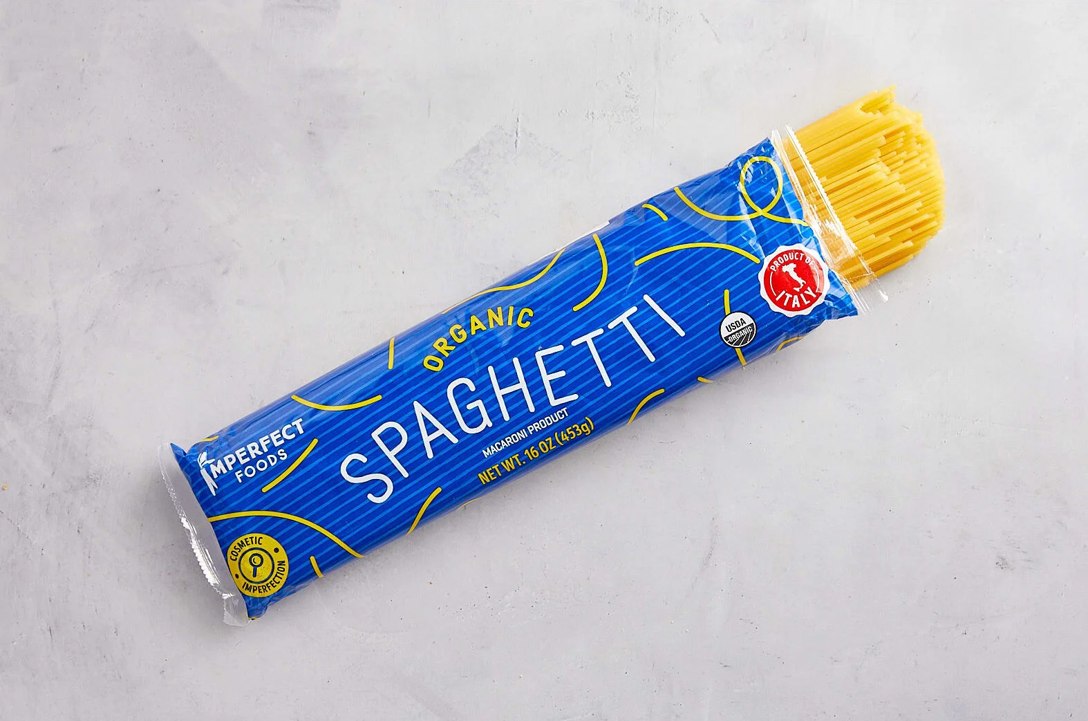
As Imperfect expanded into groceries, we needed a way to highlight that—just like our produce—many grocery items had their own food waste stories. We designed a badging system to help customers easily identify each product’s unique imperfection.
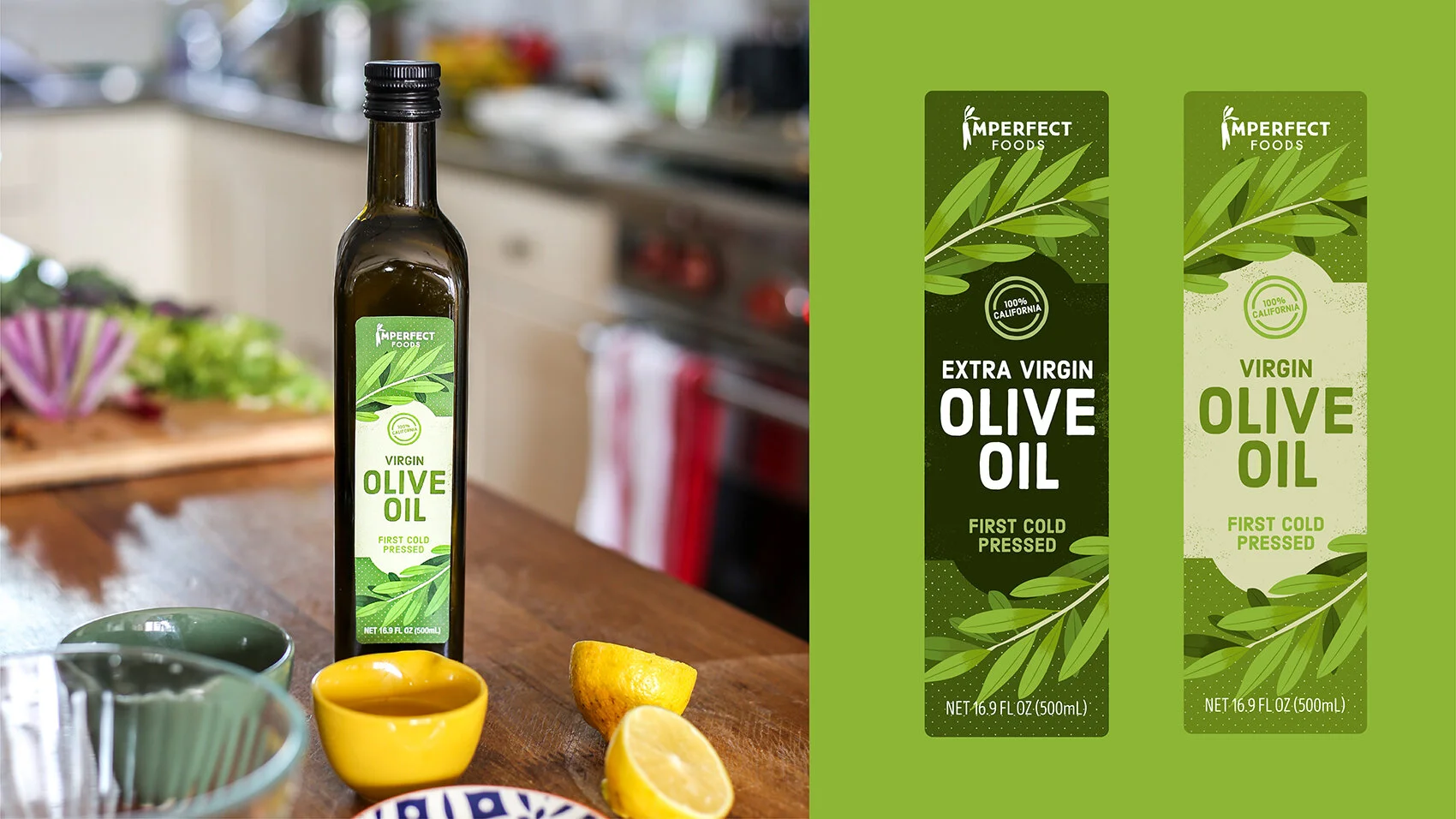
Imperfect’s private label program was an opportunity to create brand ambassadors that live on customers’ shelves—lasting reminders of who we are. Each product was designed to feel like a small, delightful gift—something customers would be proud to display in their kitchens.
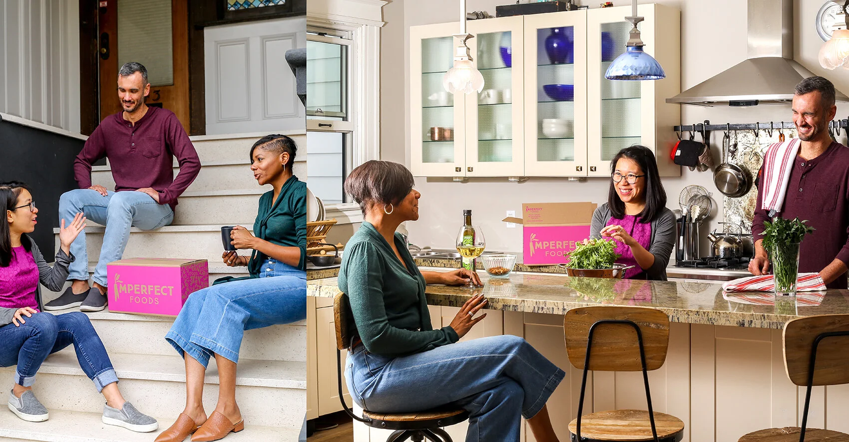
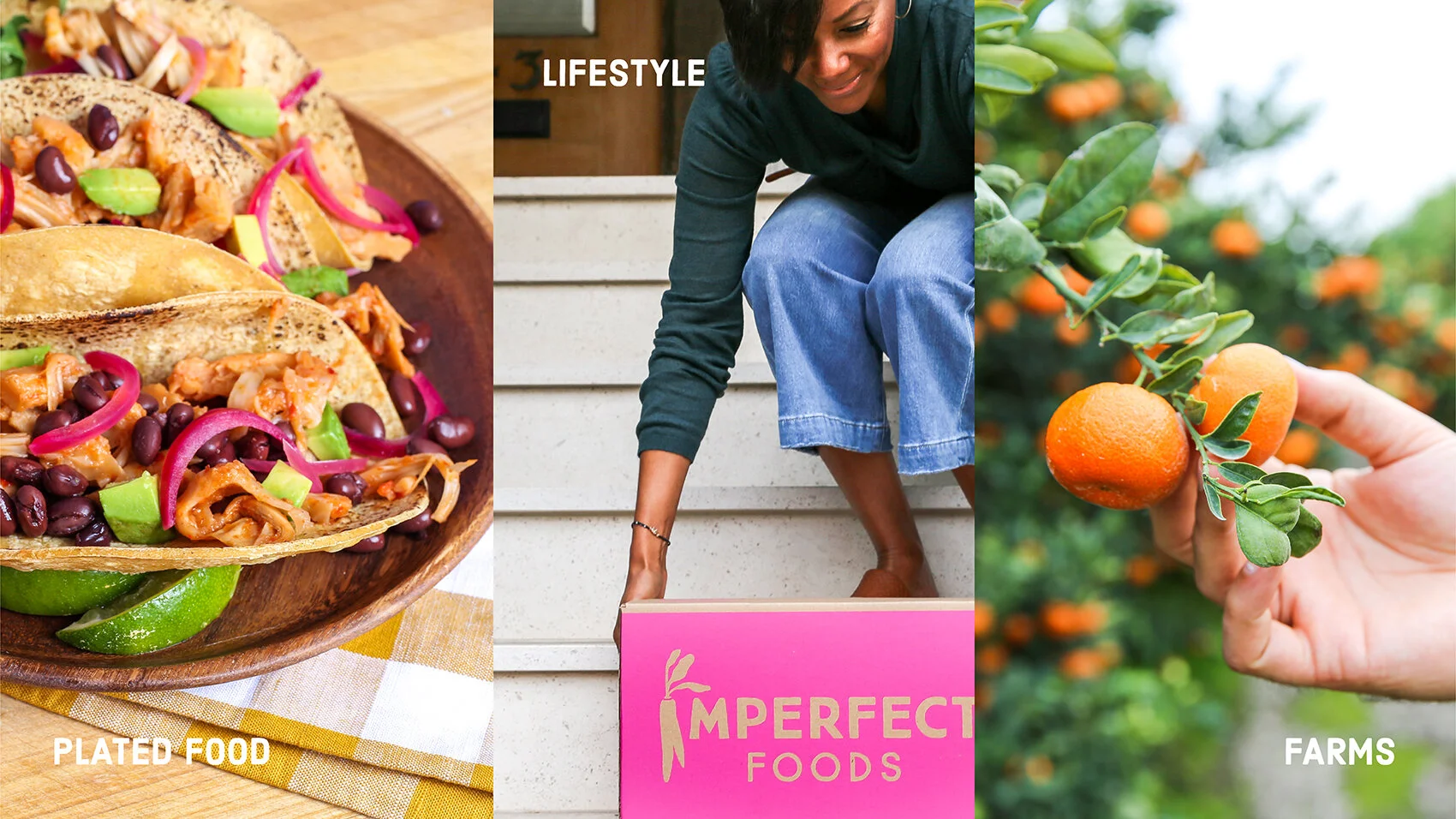
Photography is central to Imperfect’s visual identity. As part of our rebrand, we developed comprehensive guidelines for photography style, subject styling, and color usage to ensure a consistent and authentic look across all touchpoints.
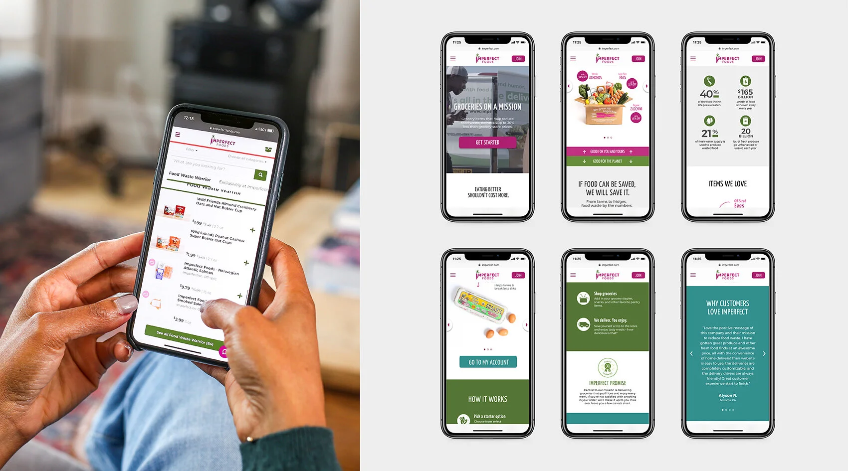
While the rebrand was underway, the product and engineering teams were busy redesigning the website. I supported the team by helping create a UI design system to be used across the new site, ensuring a seamless and cohesive user experience.